Broadwater Health Center
Lead UX Designer
Information Architect
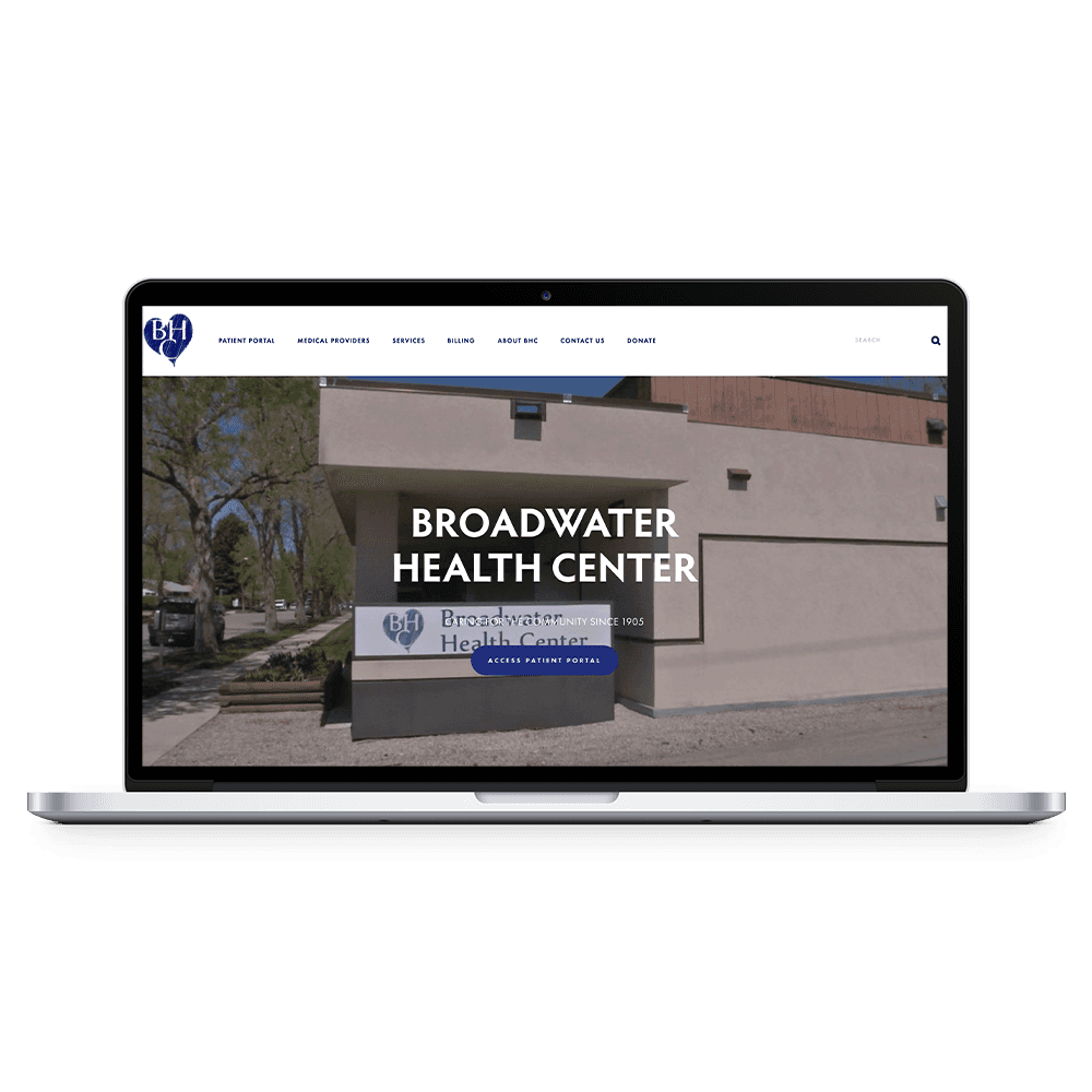
Broadwater Health Center (henceforth abbreviated as BHC) is was a hospital in Townsend, Montana. The hospital has since been closed. Their old website had a weak information architecture that lead to a confusing navigation scheme.
PROBLEM STATEMENT & HYPOTHESIS
Broadwater Health's Statement has too many navigation items and a confusing navigation scheme.
I believe that by improving the information architecture, user's will be able to find the IMPORTANT healthcare information they need.
Information Architecture
Competitive Research and Synthesis
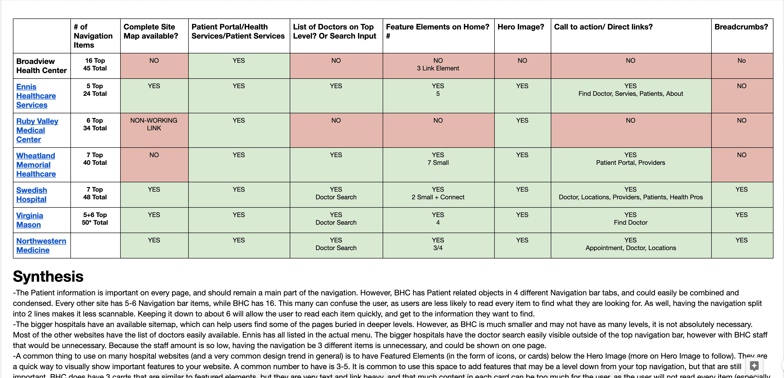
I wanted to start my research by looking at what other hospital websites are doing correctly within their information architecture. I focused on things like what content they had in their navigation scheme, the amount of navigation items, as this would be a good place to start when fixing BHC's IA. I also looked at things that had to do with IxD (Buttons/Call to Actions, Breadcrumbs, feature elements) and Visual (Hero Images). I synthesized and documented my findings so that I could call back to this information in my next steps, as well as confer and present with my contact at BHC.
Card sort
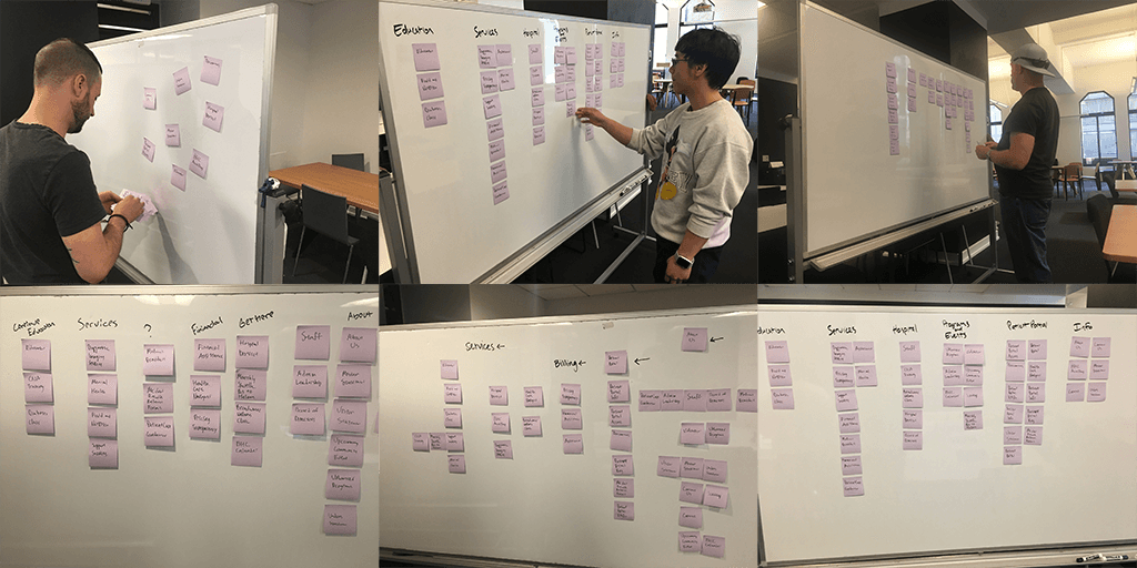
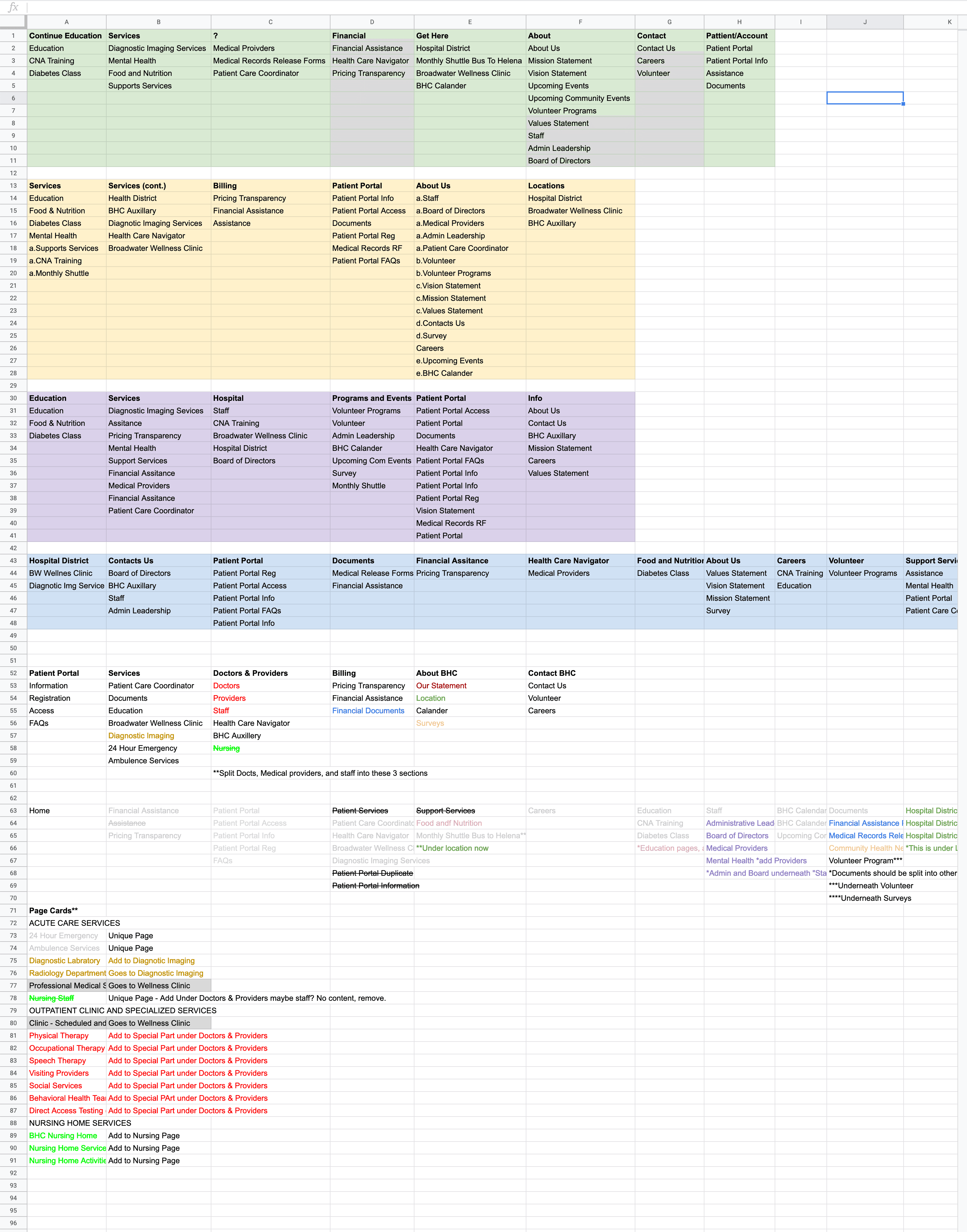
I put every navigation item onto a Post-It and conducted an open card sort with 5 users to get a better idea of what categories the user's thought each navigation item should go under. After documenting my synthesized findings, I conducted a closed card to further get a better idea of where the users felt the best place to get their information would be. Along with my competitive analysis findings, I had a good idea of how I wanted my navigation scheme to look like, and I used this information to start my interaction design process.
Interaction Design
Wireframes
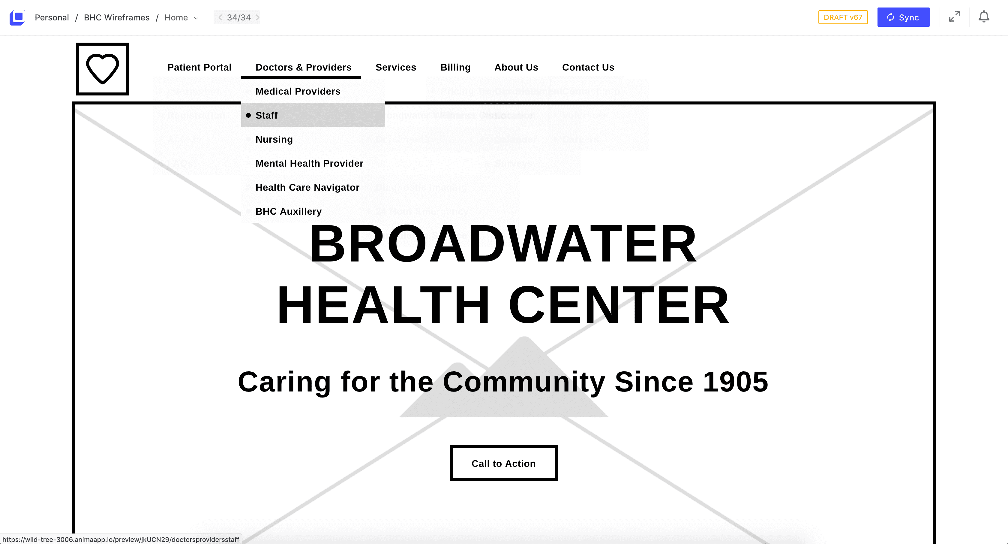
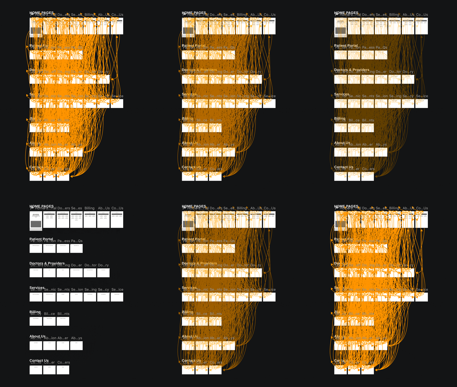
I created wireframes in Sketch, and using the Anima plugin to show interactions and page layout. More importantly, I was able to give a proper look at how the navigation would be used. I was able to properly use these wireframes to do some usability testing. After iterations, I also used the Anima plugin as hand off tool to the developer.
CONCLUSION and UP NEXT
I have handed off the wireframes to the lead developer. He has implemented the correct Information Architecture navigation scheme along with the proper content layout into Squarespace. I will remain as a consultant for any needs or changes that may happen.
Note: After this case study was published, BHC was acquired by a larger hospital, thus changing names and total branding. The BHC website was closed and integrated into the new hospitals website.

