King of the Court
Mobile App UI Designer
Role
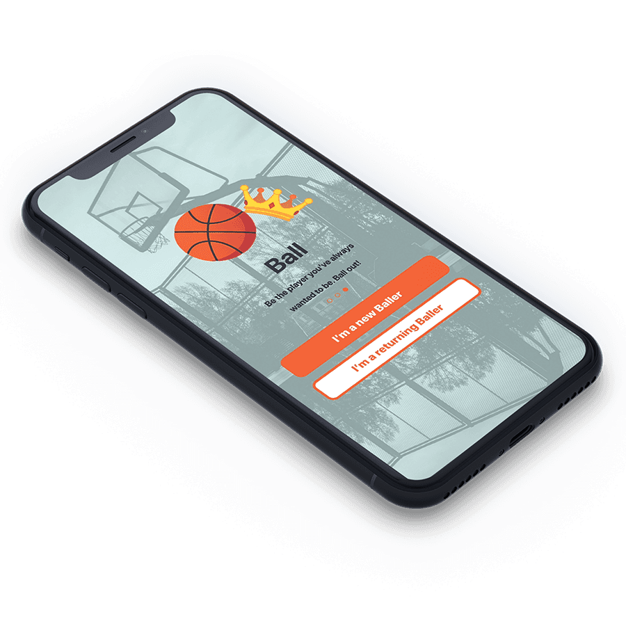
King of the Court is "King of the Court will be a mobile app used by basketball players to manage themselves and their local courts. This system will be designed to connect, maximize the time efficiency of and track progress of players."
Basketball courts are a hub for friendship, competition and self-improvement. The KoC system will be utilized to revamp the user experience of local ballers. By providing a real-time, digital representation of a selected court, ballers will be able to view the status of their favorite courts from their phone. Time will not need to be wasted to find out if a basketball court is too busy or not busy enough for a baller's specific needs. Baller's will have the option to track their progress, so that they can visualize and analyze their own performance. KoC aims to improve the current system of playing basketball by providing a digital platform for ballers to connect themselves with others and boost their own skills. KoC is designed to provide ballers with quick access to information by developing the system for iOS mobile devices.
I was tasked with creating the User Interface in Adobe Xd based of the system requirements given by Jakob, the product owner. King of the Court was conceived by Jakob, a developer, and I created the UI in Xd in order for him to develop.
Who worked on this project?
✔ Jakob Lopez - Product Owner (client) & Developer
✔ Me - User Interface Design
How I accomplished my tasks
These processes
✓
Sketches
✓
High Fidelity Wireframes
✓
Prototypes
Using these tools
✓
Pen, Paper, and sketchbook
✓
Adobe Xd
✓
Adobe Illustrator CC
✓
Adobe Photoshop CC
Ideation & Hand-off
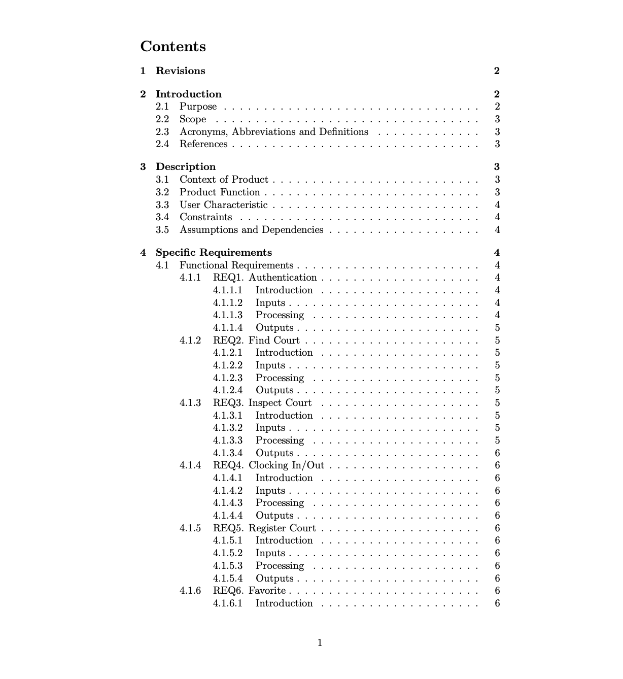
I received a System Requirement Specifications file from Jakob. This gave me an idea of what screens were needed so I could start with the user interface and interaction design.
Sketches
I did some quick ideation from the SRS and sketched out some interface ideas.
High-Fidelity Wireframes
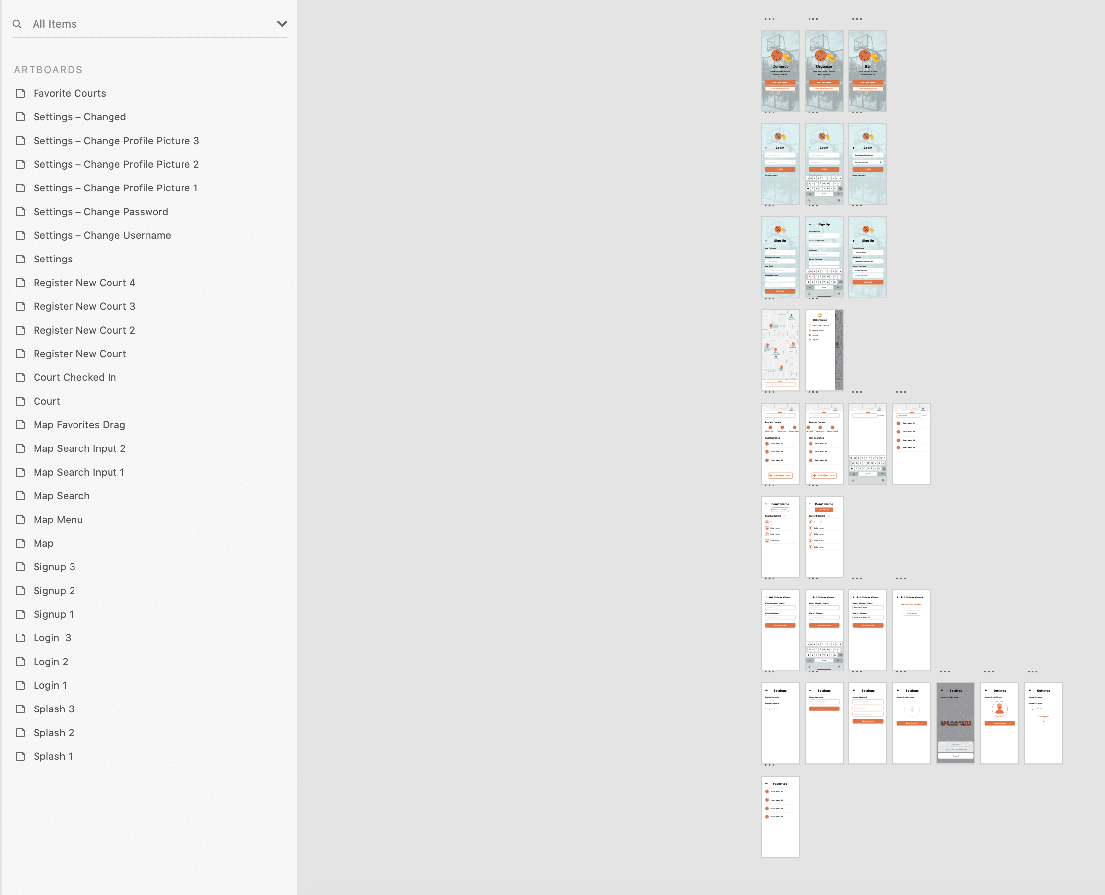
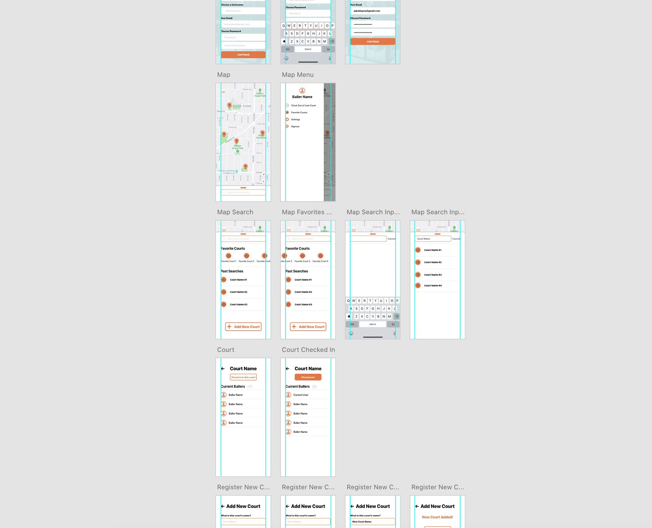
From my sketches, I created wireframes in Adobe Xd. Through the SRS and communication with the client gave a good indication of color and use of Human Interface Guidelines (Apple's design system), so I made my wireframes in high fidelity.
Prototypes
I used Adobe Xd's prototyping tools to create a working prototype of the app, so that there was clear indication of user interactions. This would make handing off the file much easier, as there would be no guess room for the development of what needs to be done.
Conclusion and Next Up
Jakob (the client and developer) will be releasing the app at future date. There is possible room for more features and usability testing.


