UX Designer
Scotsman Guide

UX Designer
Scotsman Guide

UX Designer
Scotsman Guide

What is Scotsman Guide?

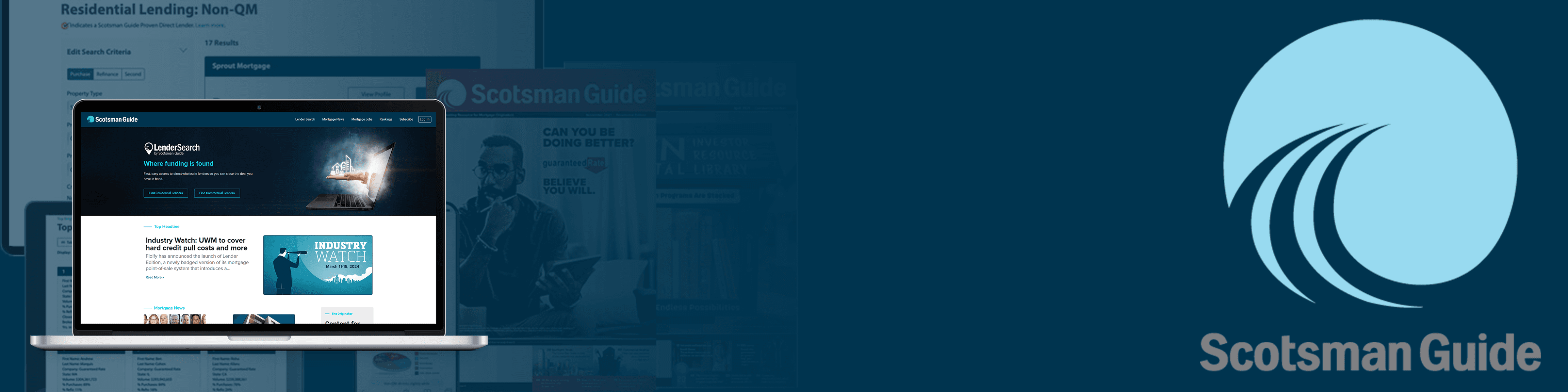
Per Scotsman Guide's website: "Scotsman Guide's mission is to help mortgage originators expand their lending networks, close more deals, and grow their businesses"
Scotsman Guide's main products were the digital Lender Search and magazine publication.

What did I do at Scotsman Guide?

  • Lead UX Designer for all projects

  • Collaborated closely with the Chief Product Officer, Marketing and Front End Development

Animation of SG's logo I created used for page loading. Used After effects to create the animation, and Lottie for hand-off

#circulation-tool

Designing an internal subscriptions tool to streamline subscriber management for the Circulation team

Project Goals

The goal of this project was to design a new internal subscriptions tool for the Circulation team.

The Circulation team was responsible for managing over 110,000 subscriptions, using an archaic tool called Multipub. The new tool needed to improve efficiency of the most important functions of Multipub, and adding new features while not disrupting how

The needs of this tool were:

  • Manage subscriber information

  • Export subscribers for a publisher

  • Import new subscribers from external lists

  • Overall create a more streamlined & usable process for the Circulation Team.

Final screens of the dashboard

Mockups of a few of the finalized screens of the dashboard

Research: Circulation team and Multipub

  • Conducted user interviews and observed the Circulation team to gather insights.

  • Focused on understanding how the team used Multipub in their daily activities.

  • Identified pain points and key features that needed to remain in the workflow.

User flows layered on top of a picture of a card sort

User Flows and card sorting, two of the main ways I synthesized my research

Synthizing research and ideation

  • After interviews and observation, I analyzed the notes to identify patterns in the Circulation team's workflow.

  • Found that the process mainly involved codes and three key task flows: tracking renewals, importing or adding new subscribers, and exporting subscriber info to a publisher.

  • Created an updated user flow and began designing wireframes based on the findings.

  • Conducted usability testing with participants familiar with the lender industry, as well as the Circulation team.

Final Screens Handed off to Dev Team

  • After multiple iterations and feedback from project stakeholders and usability testing, I created all necessary screens for the project.

  • Delivered over 40 screens along with detailed documentation in Confluence for the dev team.

Finalized screens of the dashboard

Mockups of a few of the finalized screens of the dashboard

#subscribers

Redesigning a highly used website feature: sign-up and subscription management for new and returning subscribers

Project Goals

One of Scotsman Guide's main products is it's magazine. New subscribers had trouble signing up for subscriptions, while current subscribers had problems with managing their subscriptions.

  • Designed two separate flows for new and returning subscribers, focusing on improved data entry.

  • Enhanced the user's ability to understand which subscriptions they are signing up for or already have.

  • Aimed to increase new subscribers, receive positive feedback, and improve retention of current subscribers.

Different screens from the sign-up flow in front of a laptop mockup

Part of the new updated sign-up flow

#profile

Updating originator profile pages: increasing Lender Search engagement

Computer mockup of the profile

Final mockup of the profile

Project Goals

Originator profiles were a main feature of Scotsman Guide's Lender Search product. The main goal of Lender Search (per the website) was "connect directly with a … lender", a.k.a. user engagement with the lenders that would show in the search results. The profiles did not display the most useful information quickly to users, leading to a drop-off in engagement with the originators found through Lender Search.

By redesigning the profiles, I believed I could:

  • Get users the most important information about the lenders in form of a "Quick View"

  • Lead users to fill out engagement forms or click-through to the Originator's website

Research: Survey initiative

  • Sent out a survey to all originators subscribed to the service and signed up for market research, identifying key trends in the data that mattered most to them

  • Conducted interviews with different originators to understand the most important information to display on a profile at first glance

  • Designed a "Quick Look" area called "What We Offer" and flushed out the "Who We Are" and "What We've Done" features based on user feedback

Profile research images, then images of early wireframes, and then a mockup ofthe finals design

The process of the redesign, from research to high-def wireframes

© Nick Brosas Design 2025

I don't really know what to put in a footer for a portfolio

© Nick Brosas Design 2025

I don't really know what to put in a footer for a portfolio

© Nick Brosas Design 2025

I don't really know what to put in a footer for a portfolio