
Case studies as a UX Designer at Cayuse, LLC.
Case studies as a UX Designer at Cayuse, LLC.
Case studies as a UX Designer at Cayuse, LLC.
About Cayuse
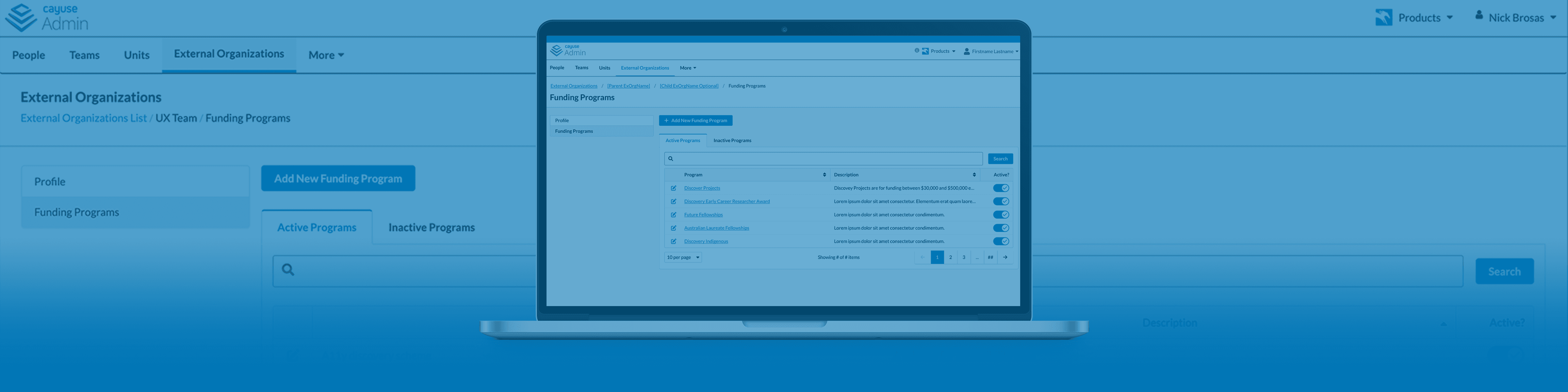
"Cayuse is a cloud platform that helps research organizations manage billions in research funds and drive impact across the entire research lifecycle." Cayuse is research administration SaaS centered around grants.
My Role
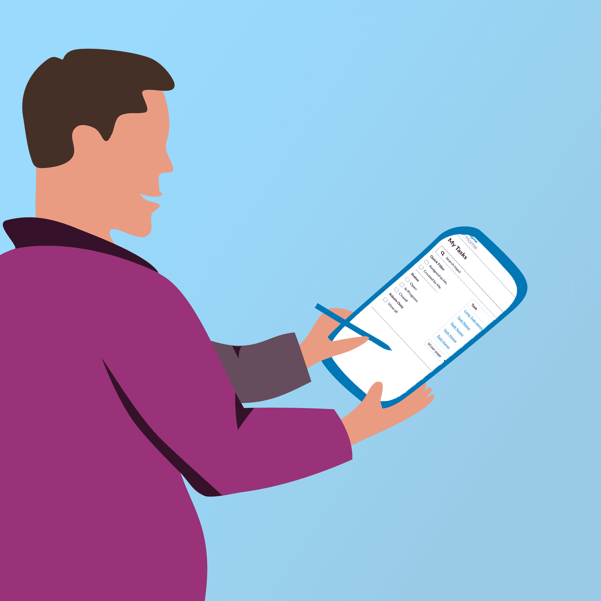
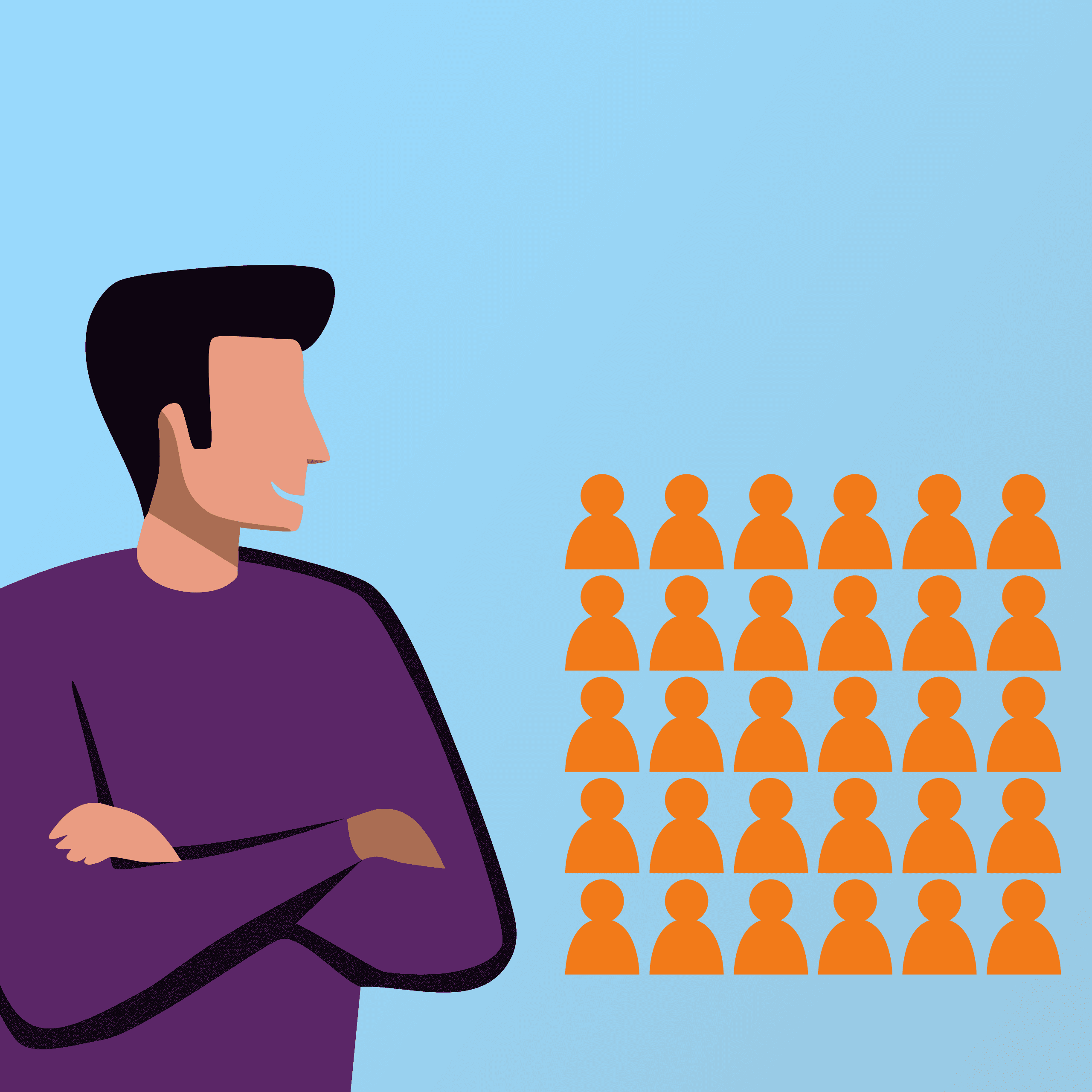
UX Designer on multiple product teams, Owner of Design System, Accessibility Guru
Case Studies

© Nick Brosas Design 2025
I don't really know what to put in a footer for a portfolio
© Nick Brosas Design 2025
I don't really know what to put in a footer for a portfolio