#product #fundmanager
Redesign the Fund Manager dashbaord: A research-driven approach to display key fund data
Problem
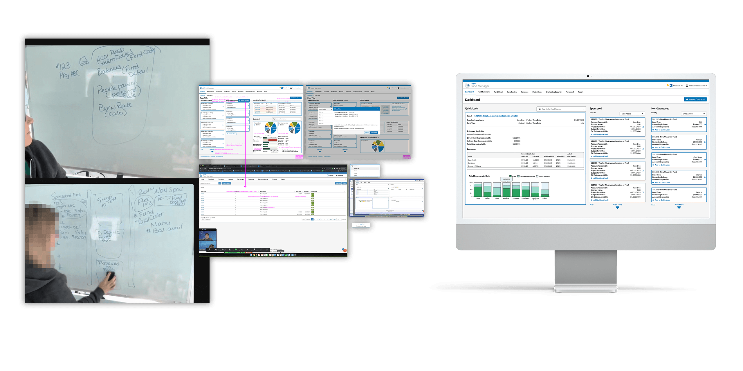
Fund Manager's main screen was an incomplete data table with useless information, built an old 3rd-Party framework. Fund Manager usage was low, as quick information was not readily available , and it was hard to find the more detailed data users needed.
Goal
We wanted users to quickly find the Fund information, and gain more direct access to the fund's detailed data. User research would be the driving force behind finding the most important information.
Key takeaways
Research was a huge focus; the main mode of user research was user interviews, and would key in on what data would be most important to display to users.
Other decisions and data points were made based on the knowledge base of the PM, who was a Subject Matter Expert in the (niche) fund manager administration world
User research + SME provided enough information to have correct data displayed, as well as filling in the gaps of how best to display the data in the designs
2 key features were designed based on the research:
Quick Look contained tables and graphs to quickly show important info of a selected fund
A new card component for funds were a way to display a list of funds with key information at a glance.

