#designsystem
Creating, Maintaining, and Championing the Adoption of Cayuse's Design System
KEY POINTS
Over 50+ Components/Patterns audited
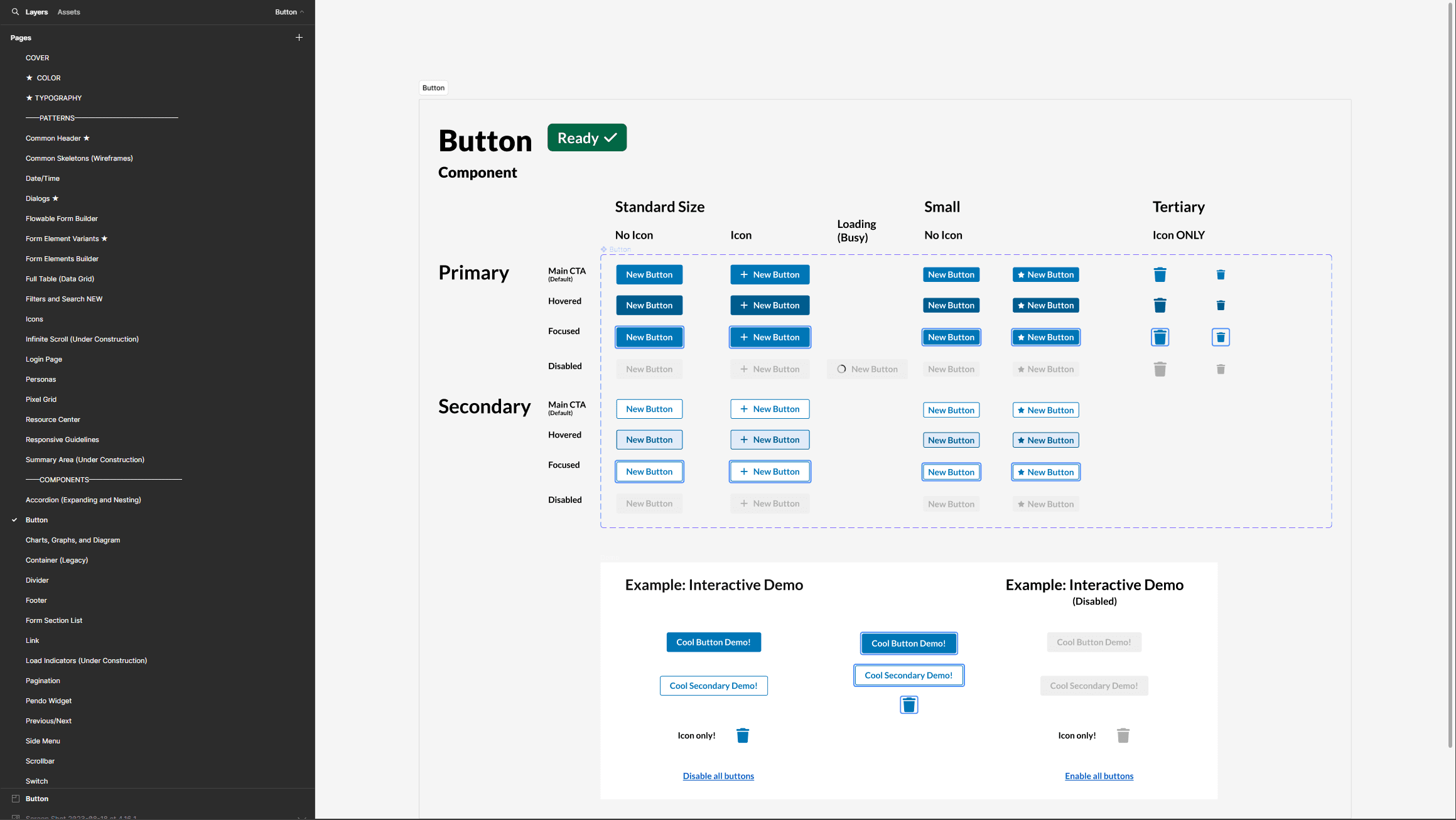
Created Figma component library
Created documentation outlining acceptance criteria
200+ accessibility issues fix by Accessibility initiative
Worked with developers to create 50+ code ready components in code library
A look at how the components look in the Figma library, created from scratch
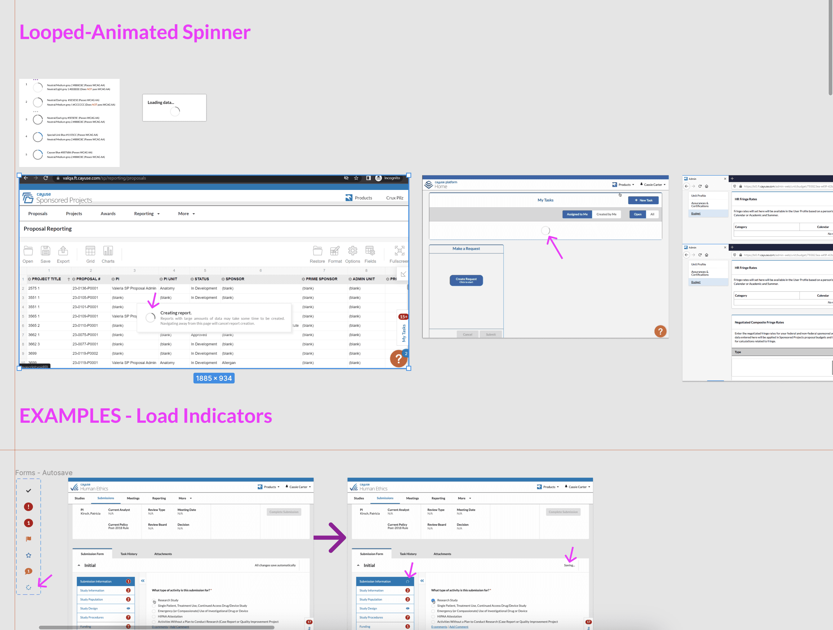
Auditing the current products
Multiple product teams had different usage of components on their products
Designers using different components with different styles, sizes, etc.
Different code caused different behavior and accessibility issues
No consistency
An example of how I audited different components, in this case a load indicator
CREATING THE FIGMA LIBRARY
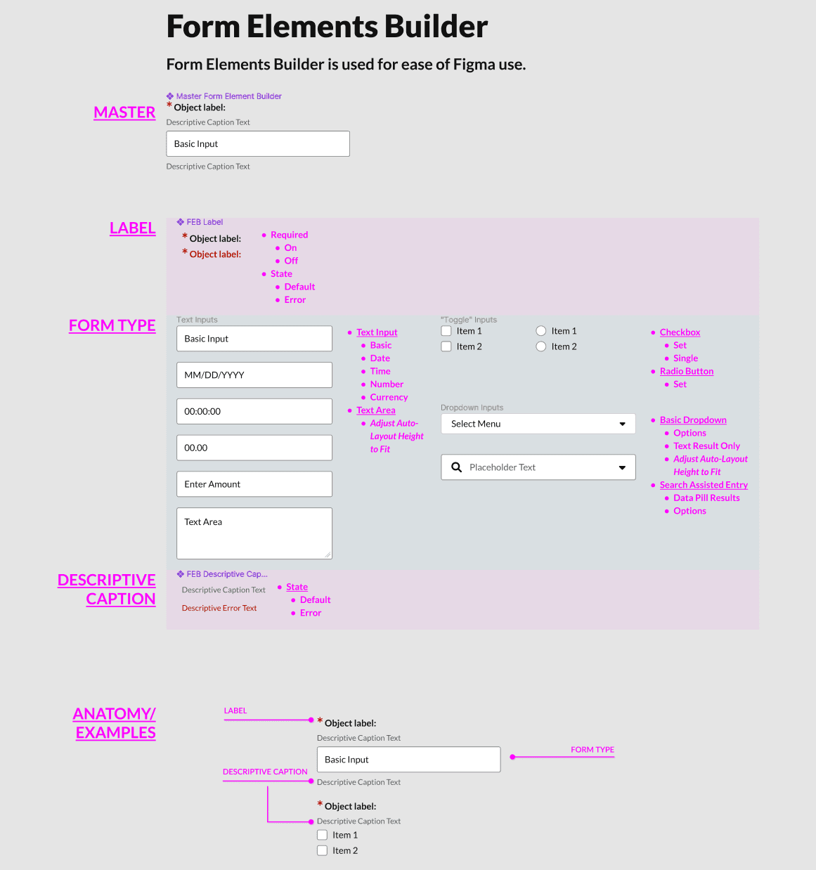
Using Figma features to create components and variants (eg. Product specific)
Improved efficiency in creating wireframes
Form element component - shows hows I used variants to build component for any situation
CREATING DOCUMENTATION
Documenting all aspects of how component is used
Not only for designs, but criteria to be followed by PMs and Devs as well
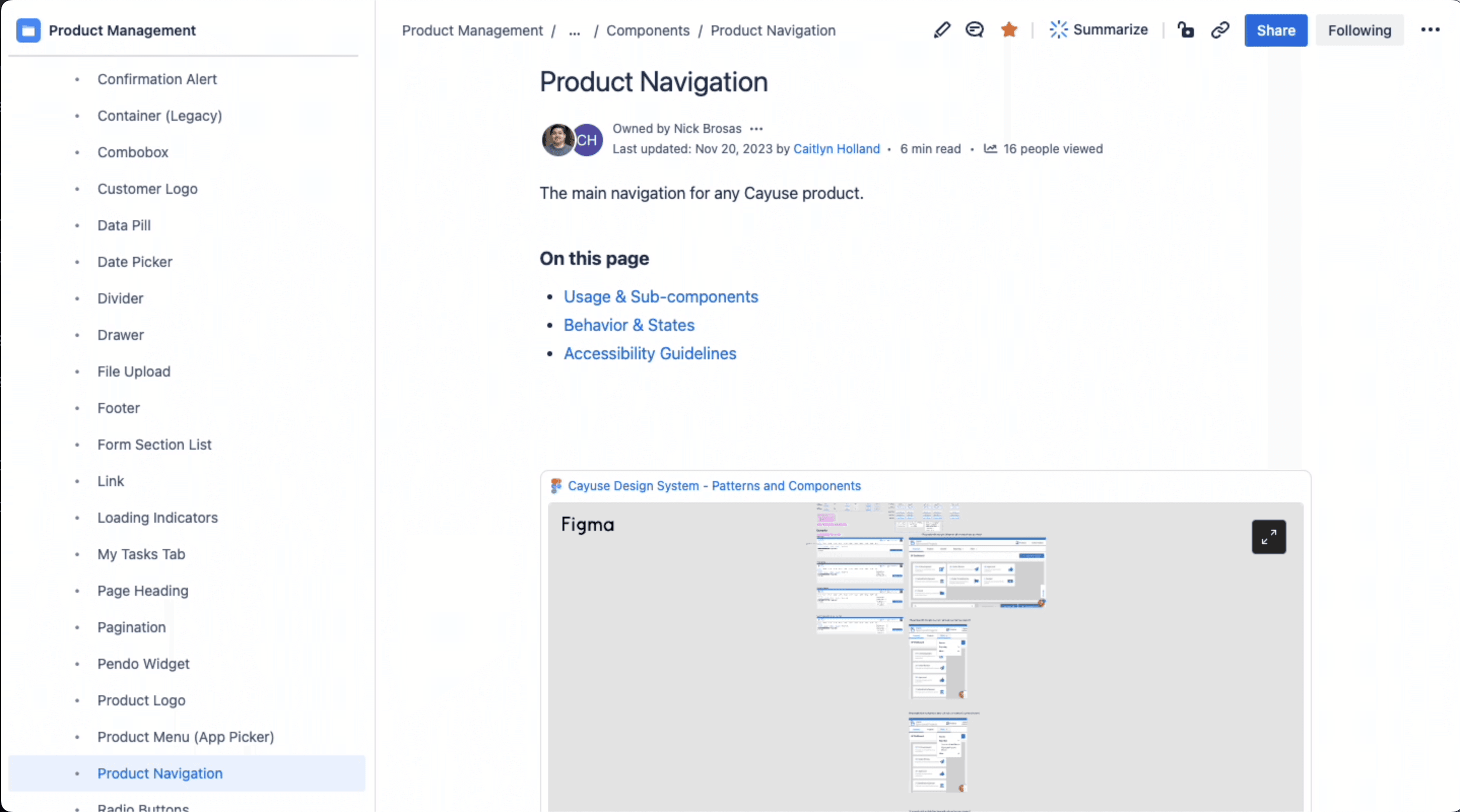
Design System documentation lived in a Confluence space.
ACCESSIBILITY INITIATIVE
Aligned with company wide accessibility initiative, but not originally part of plan
Always have accessibility in mind when creating components + documentation
Allowed for a better way to prioritize some work
Allowed for large amount of ticketed accessibility issues to be dealt with at once
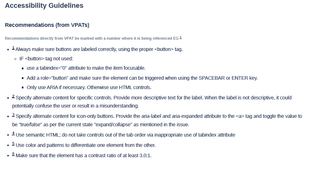
An example of what Accessibility Guidelines looked like in documentation
CODE READY COMPONENTS
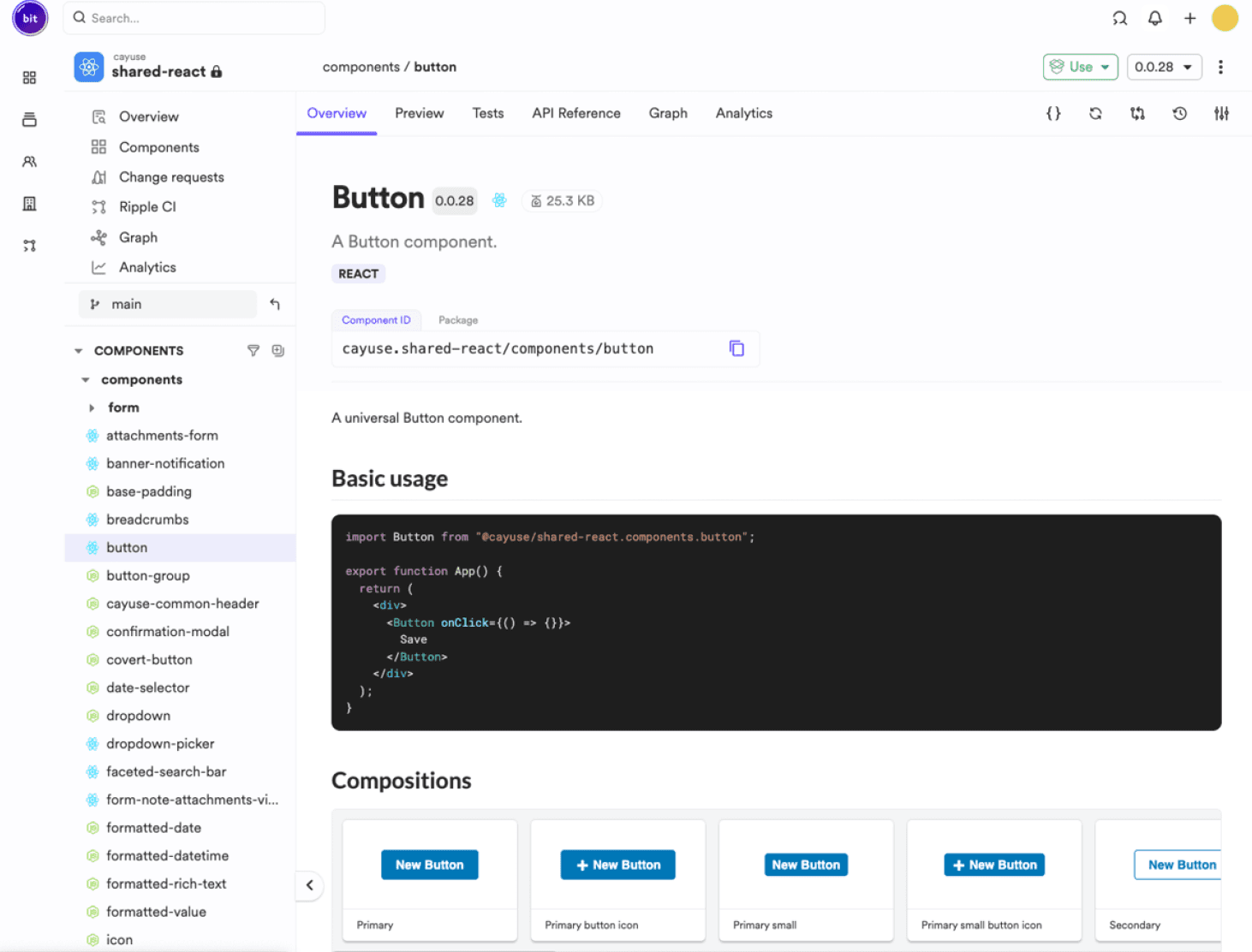
Worked with developers to make a code ready library in a service called bit.dev
Would review every component to make sure it matched the documentation and accessibility guidelines
Worked with other teams to make sure components were usable and did not break current live product
Code ready components lived in a shared bit.dev space
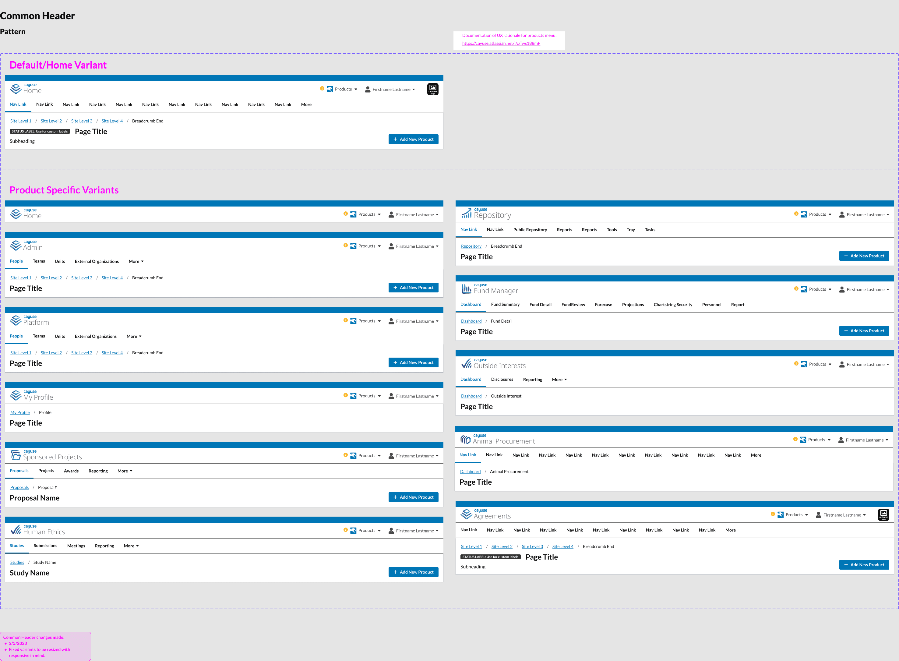
The "Common Header" component,. Very important as it was one of the few shared components used by EVERY product
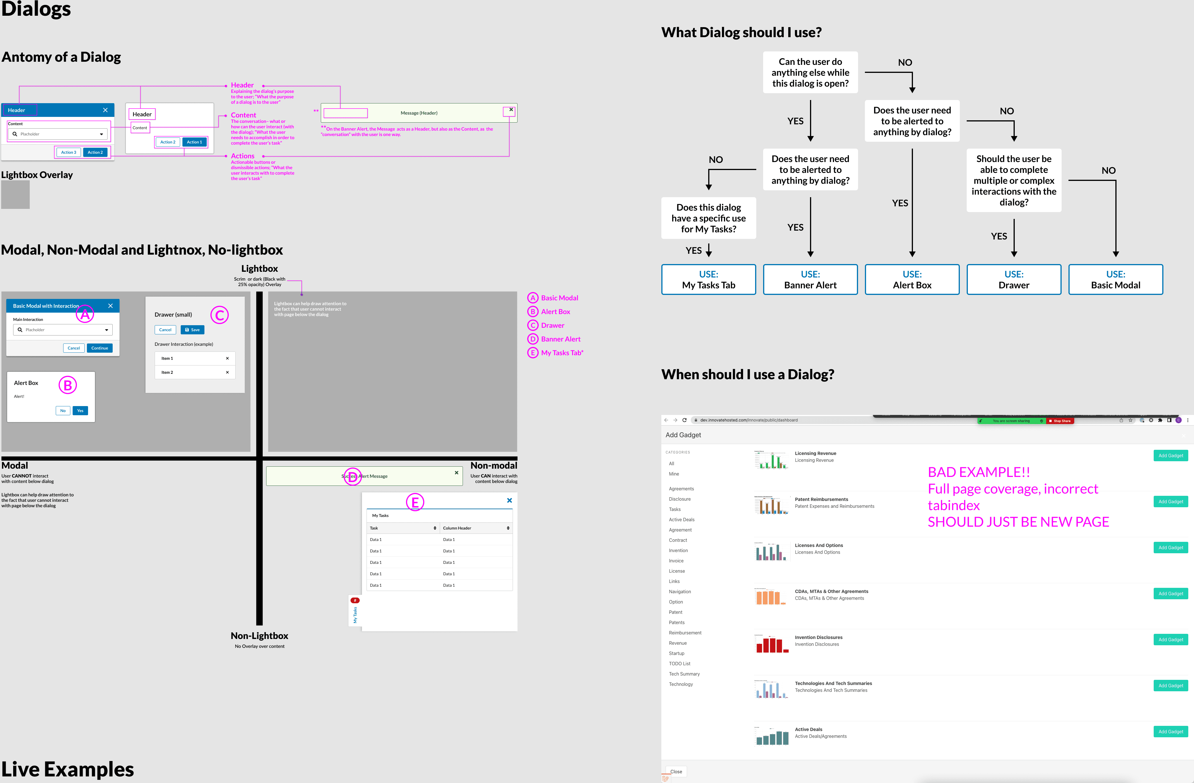
Dialog component, also called a pattern. In Figma page, would contain examples and rules
